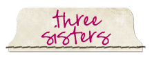
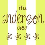
Hello there! I'm trying really hard to be a better blogger because I love the idea of blogging. I just don't have very many interesting things to blog about. Just recently I thought I would try out a new logo for our Three Sisters. We are still alive if you are wondering. We have a show coming up on April 3rd in Evanston, WY. More details on that later. Okay back on track.
BEFORE:

AFTER:

Now I need your opinions! What do you think? Should I keep with the old one or go with the new one? Leave a comment by Saturday and I will pick a winner and send them something handmade. You won't want to miss out on this chance! I would really appreciate your feedback. Thanks guys. :)
P.S. Kendra and I have come up with some cool new products to sell at the next show! Stay tuned between now and April with some sneak peaks! I will give you one hint: I will be making things that are not baby related. I'm excited to start making these goodies and to show you!


6 comments:
I love both of them! I think both look so cute. I love the font in the new one though! I can't wait or you to blog more, you make such cute stuff! Good luck at the fair!
I love them both, I think I like the shape of the 2nd one and how it's set up but the only is the Sister word is hard to read. And the lining up middle of the S's are distracting. BUT I like the second one better, but maybe a bit more work on the word sisters might help. But what do I know. Just my opinion. LOVE YA!
I definitely love the second one better.
First of all it's only one color; good job on achieving that using a play on negative and positive space (Save on printing too!). Yet it still looks similar to the old one, just a little simpler.
Plus it looks like a seal… you could use it for packaging as a sticker.
Good luck; I love your blog and looking at all the cool things you and your sister make.
i don't deserve any giveaways so don't pick me! but i like the top one. love the stripes and the fonts. i like the shape of the second one but the writing isn't as BADA BING BADA BANG as i would like it to be... Both are cute tho. Just like YOU!
Can I just say ditto to Alisha
s comment...? Really she said what I was thinking- but it sounds better when she says it.
I really like both of them too. the first one is much easier to read than the second one but I do like the shape of the second one. I guess I will have to agree with Alisha too, maybe combine the two!
Post a Comment